Modify a Theme
You can modify
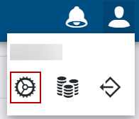
- Open the User menu.
- Click Admin.

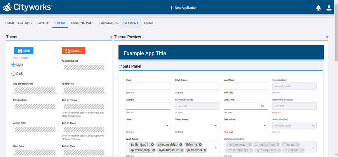
The Theme panel populates with different field types that can be modified, such as text input, number, check box, etc. You can base the theme on a predefined Light or Dark theme and then modify it by changing the overall primary, accent, and warning colors or by the specific field type.
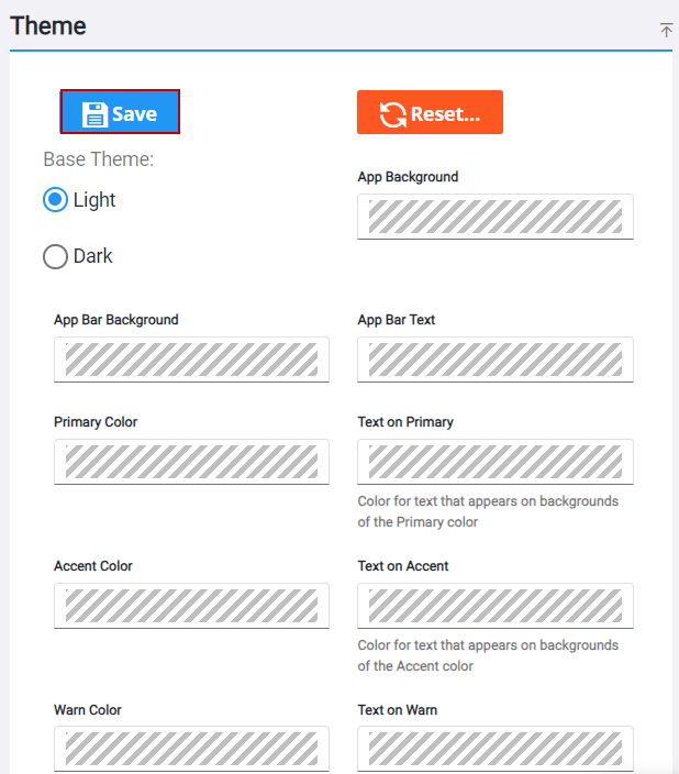
- Select a Base Theme of Light or Dark. This will generate a preview of what your edits will look like in the Theme Preview panel.
 NOTE: A Base Theme option is not automatically selected upon creating a theme for the first time. Selecting Light or Dark before making edits will ensure the preview that displays in the Theme Preview panel is what your theme will look like when it is used in an app.
A Theme Preview panel appears and displays how your changes will look based on the field types you modified in the Theme panel. This panel is broken up into sub panels.
- Inputs Panel: This displays a preview of how fields where information is entered or selected, such as entry (input) fields, number, drop-down lists, multi-select lists, check boxes, switches, and option buttons will display.
- Advanced Panel: This displays a preview of how tables, lists, or hierarchies will display .
- Button Panel: This displays a preview of different button styles and tooltips will display.
- Text Panel: This displays a preview of how text throughout all panels, buttons, tables, etc. will display. Some text is customizable with other fields in the Theme panel.
- Chart Panel: This displays a preview of how charts will display.
- Modify the fields in the Theme panel and see a preview of the changes in the Theme Preview panel. See
-
Changes to the theme are saved.